Safe In Green
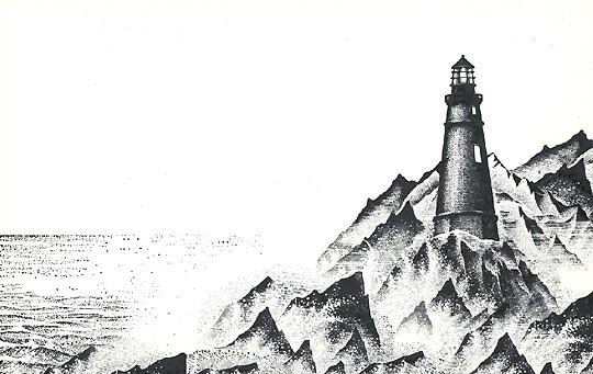
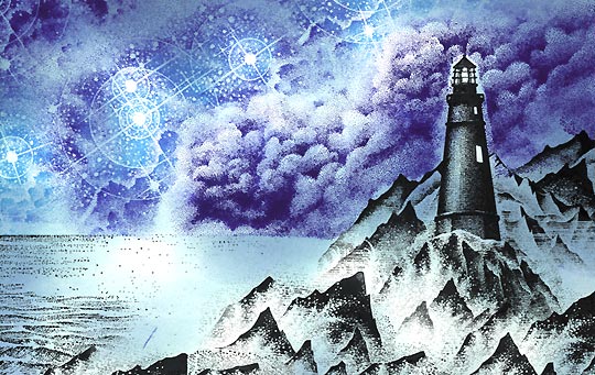
Light, Rocks, & Waves-220G, Rocks & Waves-235E, & Fog, Cliffs & Waves-257F were arranged in this stack. Stamped out in black. A small portion of Seaside Cove-139H was stamped to the left in black to create the sea and horizon line. The only masking needed here was of the lighthouse when 257F was stamped behind it.
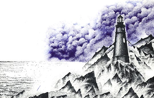
Cloud Cumulus Lg.-019G was stamped twice in Marvy Prussian Blue #29. I wiped off the top of the clouds before I stamped them as I knew I was going to stamp something else up there on the next step that might be lighter in tone. Again, the lighthouse was masked along with the rocks and ocean horizon line.
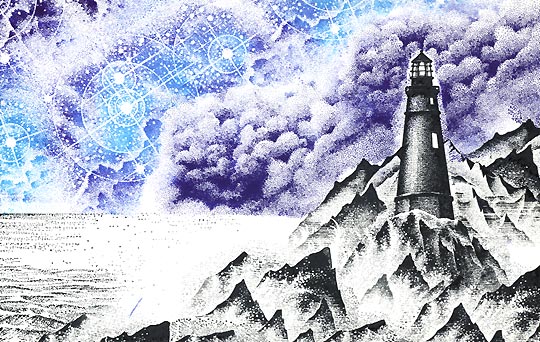
Star Birth-217G was stamped in the sky four times --overlapping the previous images a little to give them a blended look. The outer edges of 217G was colored in Prussian Blue #29 but the inside areas, around the stars, were colored in Marvy Manganese Blue #36. I wanted these stars to look like they were glowing in a darker sky.
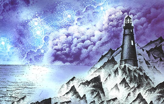
The Tonal Applicator-084E (T.A.) was used to start blending in tone to this scene. I used a Ranger Industries (R.I.) Sea Shells Ocean Aqua. In areas difficult to reach with the T.A. I used a Stylus Tool (S.T.) from Colorbox, in a dabbing motion, to apply the blue ink. Notice the areas that I left pretty light, if not the white of the paper --in a couple stars, top of some clouds, water's surface, splashing waves, and in the light areas of the lighthouse.
The T.A. & S.T. were used in a Marvy Salvia Blue #60. The dark areas are getting deeper now with each consecutively darker color. The big point in this scene from last is that #60 isn't a big leap in value from the previous color -- Ocean Aqua. Take it one gradual step at a time and the color layering becomes easier and the end result --richer/deeper colors.
The T.A. & S.T. were used in a "Stamp it" blue --no specific color listed on pad. It's just slightly darker than the #60.
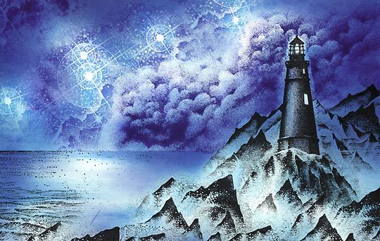
The T.A. & S.T. were used in a Ranger Industries Sea Brights Sailboat Blue. The color scheme is starting to get dark now.
The Stylus Tool was used in a Marvy Blue #3. By now, I'm not applying too much of each individual color. I'm only darkening certain areas such as the top corners of the sky and behind the lighthouse.
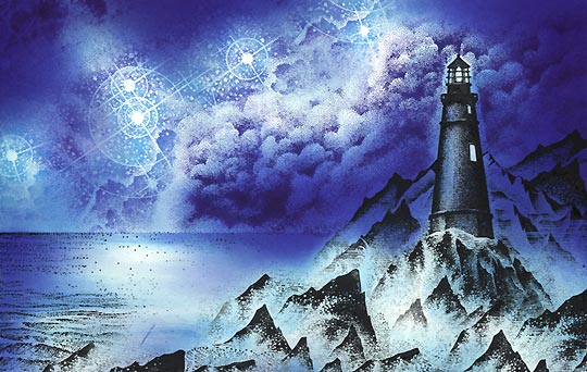
(R.I.) Sea Brights Pool was applied with the Colorbox Stylus Tool. In the scan there's only a slight difference in this step. I wanted to "mellow out" the color scheme that was developing. Pool has a slight green tinge to its medium blue tone. I've added it all over in various values. In some areas I almost dry-brushed it onto the scene where I wanted a very light touch of it. In the sky, I've added quite a strong saturation. I've tightened up some of the area around the lighthouse where I over masked it out (where it left a blank area).
I liked the direction the scene started to take with the greenish tinge so I took it a step further with a Marvy Pale Green #34.
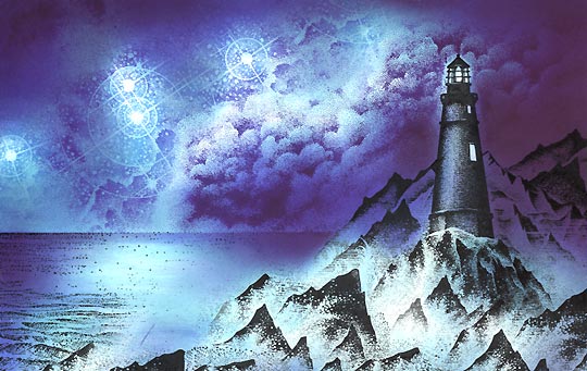
Stylus tool: Black was used to finalize the value scale. I added quite a bit of black to the right of the lighthouse. I wanted the lights to really stand out so I made the area around it darker. Black capped off the composition on the upper left corner and took the water edges one step darker.
I thought I might have lost too much texture up in the upper sky area so I went back in with Star Cluster-118E and stamped that in black several times in the darker regions up there. Sailboat-153B was stamped in black. The lighthouse "lit" areas were turned to a dye-based dull yellow (blotted out yellow to where it was almost dry) --I dabbed that color in with a waded up paper towel.
[With a cotton swab] Below, in the rock area, I've added both Colorbox (Clearsnap) Frost White and Brilliant (Tsukineko) Moonlight White brands of pigment inks. One dries slower than the other (Colorbox) while the other sets up --dries-- pretty quickly. I like them for each quality. Sometimes I want the malleable quality of one while, at other times, I might want a quick drying time so I can layer on more ink faster. The more opaque you want an area/spot the more ink you layer on.
*Trick* When I apply ink to the cotton swab head, I don't use that straight on to the paper. Instead, I blot a lot of this pigment ink off and -at the same time- I loosen or smash down the head a little. You create a softer applicator doing this and you also make the ink more manageable as it becomes almost like a dry brushing effect of adding ink. I'm adding one soft layer on top of another.
*Second Tip* This technique tends to look good as an enhancement to light areas of the card --at least when you're using white pigment ink. I tend not to use it, as fog or mist much, in the darker regions of a scene. When I have done that, it tended to look a little blotchy. But, with the Colorbox ink, you can just wipe off what you don't like and it won't smear any of the dye based inks --even after the pigment inks dry.
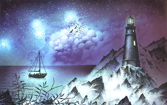
I thought the sky needed something so I added Flock-112A. I thought the bottom of the scene needed something extra over the abundance of mist so I added a couple more rocks from the Rocks & Waves-220G stamp. Looking at it, I thought it needed even more than that so I added the Bare Branch Lg.-122F and foliated it with Leaf Sprig-127A. I used a Memories Black ink on the rocks, branch and foliage as I wanted to make sure I got a nice thick black, on the scene, over all that pigment ink.
Add sparkle and highlights to your scene with Milky Gel Rollers. In this case, blue and white were used. These colors related to the color scheme used with the dye based inks so I used them here with the gel pens. These dots really pick up the splashing waves, highlights the branches and leaves, creates surface shimmer on the water, and adds extra stars to the sky. Overall, this added texture (dots) helps to create continuity between the different stamps, the different sections (land, sea, sky), and different objects (lighthouse, branches, clouds, etc.).