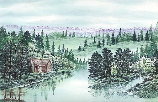
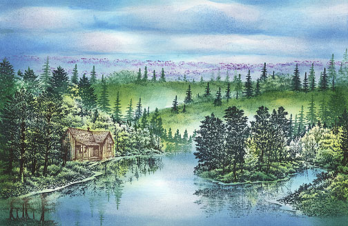
Fall Morning Mist
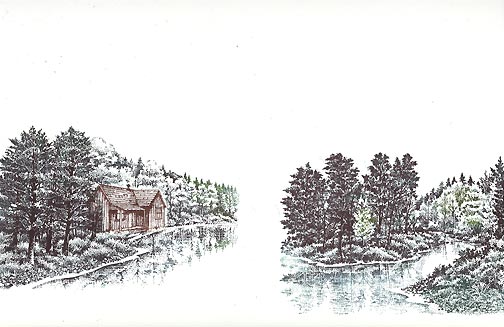
"Autumn Brook" 212G and Autumn Bank (left) 213G were stamped using Uchida Marvy Bottle Green #25, Pine Green #72, Light Green #11, and Dark Brown #18. Within Autumn Bank (left), "Country House" 247B was stamped out. This was a touch tricky as I don't have a stamp positioner but when I figured it out it wasn't too bad. What you do is stamp out the house --in this case it was done in dark brown-- and mask it out except for the left hand side of the structure. I didn't want the foreground trees in the Autumn design to appear as though they were behind the house so that's the reason for this selective masking.

"Tree Cluster sm." 266D, and "Tree Duo lg." 086B, were colored and stamped out in a Marvy (pen) "Pine Green #72", #25 "Bottle Green". Mask off the images from step one before adding these background trees. Also, note that on the left side of the scene the 266D was stamped upside down to create the reflection.
"Sedge Filler" 251C was stamped in in rows using Marvy #72 "Pine Green'. These rows will represent background hills and were stamped at two different angles so the depth would be easier to differentiate and would give some movement to the composition.
"Lakeside Cove" 048E was stamped into the empty gap between the Autumn images. I masked off the right side of Autumn Bank and left side of Autumn Brook before making the impression.
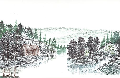
For the far hills, "Maple Trio" 240B, Tree Duo 085A, and Fir Row 243A were stamped in Marvy Pine Green #72 or Bottle Green #25. The hills were masked out before the impressions were made giving the scenes the appearance of the trees being on the far sides of the hills. These trees help to visually separate the hills in terms of depth. The farther the hills, the smaller the trees become and they're generally lighter in appearance. On all of these tree design impressions, for the most part, just the tops were used.
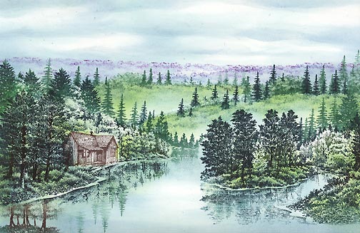
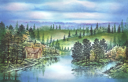
The top of "Sedge Filler" 251C was stamped in another row using Ranger Industries (R.I.) Sea Brights "Purple Surf". The Colorbox Stylus Tool* was used in a Ranger Industries Sea Shells "Ocean Aqua" in the sky, hills, trees, and water. Here we start defining some of the clouds in the sky by leaving some areas white. Much of the water was left light as well as some of the Autumn trees. We want variations in value so it's a good idea to start defining those values with your lightest colors. The Sea Shells line is wonderful for this as they're so light directly off the pad.
*If you don't know what the Stylus tool is you can check out clearsnap.com. How I use it is basically to just sponge my color on to the scene using one of the tips. My preference is the oval white one.
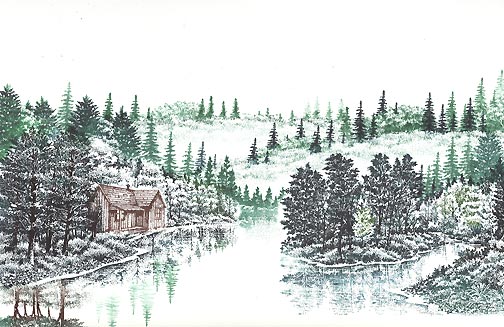
The Colorbox Stylus Tool was used in a Ranger Industries (R.I.) Sea Shells "Sea Grass" in the grass and trees and in (R.I.) Sea Shells "Cloudy Blue" in the sky and water. Note: The color wasn't applied to the area around/above the far lakeside trees. I want those tree shapes to show so I don't want to darken the area around them too much if at all. Also, there's a little area of the water that is being left untouched. I like a light area, usually, when it comes to a water's surface area.
Stylus Tool: (R.I.) Sea Brights "Cactus" was used on the tops of the hills and in the trees and a Marvy "Salvia Blue" #60 was added to the sky, water, and grass. It was time to brighten up the scene a little and to really start defining the sky and clouds.
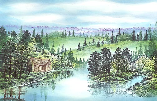
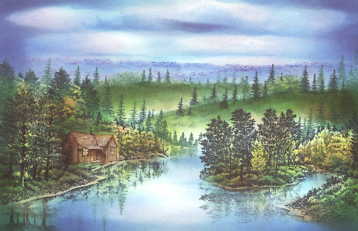
Stylus Tool: Marvy "Manganese Blue" #36 was used in the sky, far hills and water. (R.I.) Sea Brights "Beach Ball Yellow" was added to the hill grass and some of the trees. The cloud definition becomes a little bit more apparent.
Stylus Tool: Marvy "Ochre" #13 was used on the grass. (R.I.) Sea Brights "Sailboat Blue" was added to the sky and water. I didn't cover up all of the previous blue with this one as I wanted the variation of the light and darker blues to exist.
Stylus Tool: R.I. Sea Shells "Cool Peri" was added to the lower portions of the clouds. Marvy "Pine Green" #72 was added to the hilltops and in selective areas of the shoreline --touches here and there in the grasses under the trees.
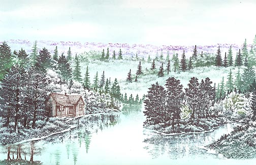
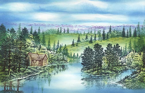
Stylus Tool: (R.I.) Sea Brights "Sailboat Blue" was added to the background hills. (R.I.) Sea Shells "Tropical Raspberry" was added to the sky --basically where we used the "Cool Peri". (R.I.) Adirondak "Terra Cotta" was used on the deciduous trees to give them a little Fall color.
Stylus Tool: (R.I.) Adirondak "Denim" was used in the Sky & Water --mostly on the sides of the scene. Marvy "Yellow" #5 was used on the trees and hills. Marvy "Green" #4 was also used on the hilltops and trees.
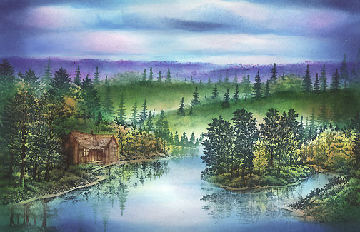
Stylus Tool: (R.I.) Adirondak "Denim" was used on the far hills to darken them in along with a Marvy "Pale Violet" #31. #31 was also added to some of the clouds.
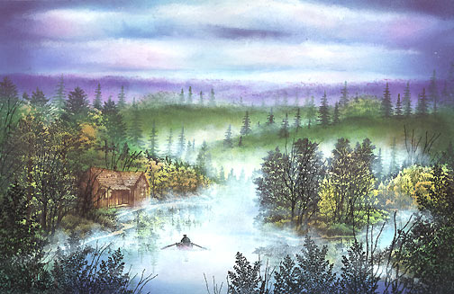
"Rowboat" 166A was added. Q-Tip: Using a "dry brush" touch with [pigment inks from] Colorbox "Frost White" and a Brilliance Pad "Moonlight White" the cloud tops were defined and a fog/mist was created on the water's surface and between the hills (which helps to further differentiate the separation/depth between the hills. Note: The fog at the base of the first green hill --background hill-- and how it phases out towards the top of that hill. Then, the fog resumes at the top of the hill representing fog between the two green hills.
I looked at this scene for a while and something was missing if not a lot of things for my eyes. I thought the shorelines became a little too ill defined as far as crisp objects went. We added a lot of color to them and I thought it lacked definition. The solution for this was to add "Leafless Limbs" 052C periodically throughout the shoreline in Black.
Also, I wanted the scene to "pop" out a little more. Solution: darker foreground images. "Quaking Aspen" 238G, "Quaking Aspen sm" 237E, Leafless Limbs Lg. 053F, and 052C were stamped in Black in the foreground. This also created more depth in the scene.
Final touch was to add highlights to the scene with Milky Gel Rollers. In this case Pentel pastel colors in white, blue, green, pink, purple and orange were used. These colors related to the color scheme used with the dye based inks so I used them here with the gel pens. The deciduous trees really needed these light colors to pop them out from the scene. The cabin rooftop stands out a little more with some highlights. They added a little texture to the tops of some clouds and added some extra texture throughout the scene.
Some additional pigment ink was added to the base of some of the central foreground trees. Give them a little more dimension being that they're basically visually flat otherwise.