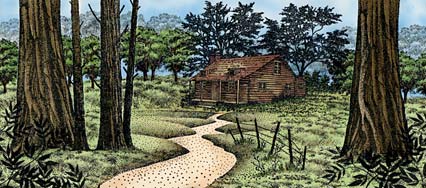
copic scene by Sandy Hulsart
It really depends on what subject matter you want to stamp but a good option would be one of the stamp sets. We've designed these sets to include some really good basic elements that can be used in many scenes. For example, a water pattern stamp can be used in all of your water scenes, a grass texture in many of your land masses or a basic cloud can be used in almost every scene. There are many approaches to scene building but my approach is to create zones within a scene: Subject/midground, foreground, and background. There can be more than one of each of these but an example might be foreground --an overhanging branch, midground --a lakeside cove, and background --a cloud in the sky. These three depths can create the illusion of deep space within a scene. Quite often, foregrounds and backgrounds can be universal. Another option to get a lot of scenic stamps in a hurry are the unmounted sheets featuring the Nature Sheets. To start scene stamping one doesn't need a lot of stamps however. It's entirely possible to create a complete scene that requires nothing more with even one stamp and a little creativity.
Return to the top of the list
Mounted stamps include wood (3/4" mount), cushion (1/16" double stick black foam), and indexing (poly laminate printed label) on top. Unmounted stamps are only the rubber dies.
Unmounted stamps can be mounted by individuals by purchasing a form of cushion and mounts. Several online retailers offer these supplies. Stampscapes does not at this time. Most stampers use unmounted stamps with a temporary mounting system with clear acrylic blocks but some will mount their stamps on wood blocks. Indexing for wood mounting is often done by stamping out an image of the rubber on to sticker paper and applying that sticker on top of the mounts.
Stampers that like the unmounted versions of stamps, and a temporary mounting system, generally like them for two reasons. First, a stamper can store hundreds of unmounted stamps (sans wood) in one notebook where the full wood mounted stamp versions can take several drawers or boxes. When people use stamps with the temporary mounting and storage system, they often use a either static cling mounting foam or a product called Tack N' Peel by Tsukineko (the company). See a site such as: rubberstampconcepts.com for more details on the static cling system. Tack N' Peel is a material that is permanently fixed to the acrylic blocks where unmounted --rubber only-- dies can be used without any foam by just temporarily fixing to the Tack N' Peel surface. Stampscapes doesn't sell Tack N' Peel but many stamp or craft stores do. The second main reason for unmounted stamps is that they're cheaper than wood mounted stamps and people can collect more imagery for the same price.
The benefits of wood mounted stamps is that mounted stamps are just nicely crafted printing tools. The indexing provides an accurate illustration of the image and allows for convenient registration when placing the image. Plus, some people just would rather not have to take the time to mount their own stamps or they just like the feel of the wood.
For information on indexing your own static cling mounting foam style of mounting material you can download the Bob Lieby
Cling Mount Indexing Guide instructions. 859K download size.
A good balance might be that one has both unmounted and mounted stamps in their collection. For stamps that you might use frequently, have them mounted and ready to use and for stamps that aren't in use very often, such as seasonal stamps, have those in an unmounted form in organized categories in binders perhaps.
Return to the top of the list
In many samples and lessons, that you'll find on this web site, a certain technique has been used to achieve the final result. However, it is necessary to note that Stampscapes is not a technique and the line is series of images that can be used in many different forms of media as can be seen in the individual galleries of the "Gallery" section.
People use the imagery with their favorite media such as inks, chalks, pastels, colored pencils, watercolors, and other media. A popular medium right now is Copic Markers. These pens and the airbrushing system that you can use with them can make very dynamic cards.
The paper you would use would depend on the medium of your choice. For example, chalks, soft pastels, and colored pencils would require a paper with a little "tooth" to it so glossy paper wouldn't be your best bet for those. If you like deep and richly saturated colors, you might try dye based inks on glossy.
A lot of the online lessons and a large part of this FAQ section is based on dye based inks and glossy paper simply because that is one of my favorite combinations and I haven't used a lot of the dry media such as chalks. However, some people and some stores that teach classes using Stampscapes imagery, have never used inks as their favorite looks are through other media.
copic scene by Sandy Hulsart
Return to the top of the list
There are many quality inks and ink brands out there now. Do you need them all? No. Do you want them all? Probably, if you're like me, but I don't have or use them all. I don't know of any that are inferior to others. What to look for is a raised pads -- so that any sized stamp can be inked-- and pads that seem like the pad material will last for many years. I would also check that the pad company offers reinkers. You don't want to have to buy a new pad every time the pad goes dry. Most reinkers have enough ink to reink the pads dozens of times over.
Personally, I like the Uchida Marvy pads a lot for their color coded cases and their ability to stack on top of one another but as of 2014 Uchida of America has made the decision to no longer order the pads from Uchida of Japan --which, in effect, has killed the pad line. Blank Marvy pads can still be ordered online in addition to Marvy re-inkers so one can still have Marvy pads but they just won't be in dedicated pad cases. The Marvy inks are vivid, the pad material remains perfect even after years of use. The Marvy inks are a little thinner than many inks so they work great in the layering process if you use that approach with your scenic stamping. Most other brands of ink are thicker than Marvy but that makes the thicker ones ideal for the first 1-2 layers of ink on a scene due to the ease of application --they spread easily as opposed to getting absorbed into the surface of the paper quicker than something like Marvy inks. However, if all thick inks are used and you try and layer 3+ layers of ink, the layers of ink start to build up on the surface and the paper starts to reach super saturation and the ink kind of "floats" on the surface and won't apply without allowing those inks to set up and dry a little.
Here are my favorite colors of Marvy inks: #1 Black. Blues --#60 Salvia Blue, #104 Caribbean Blue, #10 Light Blue, #3 Blue, #29 Prussian Blue. Browns --#16 Pale Orange, #6 Brown, #18 Dark Brown. Greens --#34 Pale Green, #11 Light Green, #72 Pine Green, #96 Jungle Green. Warm tones: #5 Yellow, #43 Brilliant Yellow, #7 Orange, #46 Crimson Lake. Violets -- #59 Rosemarie, #67 Bubblegum Pink, #9 Pink, #31 Pale Violet, #61 Deep Lilac, #8 Violet.
There are many places where you can find Marvy products and I would suggest you do a search of them but you can also source them directly here: http://www.uchida.com/product/81/re-inker and for the blank pads: http://www.uchida.com/product/393/ink-pad-un-inked
Ranger Industries offers a wide range of products and has been a significant player in the stamping world for a while. They seem to be on the edge of development always coming up with offerings such as the Distress Inks that I love. Memento inks are another line that I like by Tsukineko and Memories inks by Stewart Superior are also very good but I don't have as much experience with those as I do the Marvy and Ranger lines. I don't have experience with lines such as the Stampin' Up brand but, I'm sure, they're very good inks as well.
Bottom line, I would recommend using what you have and supplementing not by specific line but by color choices. Find a color for a certain color scheme that you like and if there are multiple brands of the same color, go with the brand that you're familiar with and like. As far as color choices, I like to have a range of values in each color family (see "What colors of dye based ink pads should I start out with?" below).
Return to the top of the list
If you're just starting out, you need not be intimidated by the selection of colors and number of lines. You can start with a nice selection of pads by selecting a first batch wisely. I recommend a range of values in some key hues:
Blues --very light, medium, dark
Green --light, dark
Red --light pink, dark
Orange --light, medium
Violet --light, medium
Brown --light, medium, dark
Black
15 pads here. If this is still too many, knock out the violets. Here's a key point: Dye based inks are
transparent. In other words, they're clear. If you know a little about colors and how they mix, you can get a world of different colors from these basic ones. If
you have pink on your card and you put one of the blue values over it, it will appear violet. What shade of violet? Depends on what value of pink and
blue you use. Yellow overlapping blue will look green. Red overlapping yellow will look orange. Etc.

Return to the top of the list
Since I just use water based media such as dye and pigment based inks, I usually just use some water on a paper towel to dab my stamps on to clean them. I have a paint brush cleaner that I'll use if I have it handy but I usually don't need that. There are stamp cleaning solutions out there that might leave your stamps in better shape than water but we use 100% natural red rubber and I haven't found the need for such items. Sometimes in a spray bottle, I might use a little diluted product like Simple Green in about a 20 parts water to 1 part Simple Green but, again, I don't really need that.
Certain card stock has a tendency of drying "flat" where colors seem to fade out. Sometimes you can give those cards a thick spray of some kind of clear acrylic --eg. Krylon Crystal Clear-- or a spray fixative --art store type spray. Others that work are clear sprays that you might use on furniture such as resin, or polyurethane usually found next to the wood stains in the hardware store. They might come back brighter if the sprays penetrate the inks and cardstock a little.
Another method that you can use is to apply another layer of ink to your faded scenes. Go back to one of your lightest colors that you applied to the scene to begin with and do another one of these coats over the faded scene. This can bring back the vivid intensity of the card. From there, seal your scene with one of the sprays mentioned above.
For new scenes to avoid the dulling out from drying, spray your scenes before they dry for the best results.
The art spray fixatives should work well in the long run without changing the colors. The others could turn a bit yellow over time. Personally, I tend to not worry about this aspect with my cards and I use all of the above depending on what is handy. I haven't seen any yellowing --that I can notice at least-- in cards that I sprayed as long as 15 years ago.
![]()
![]()

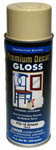
Ken Pesho is an instructor in AZ and he really likes the Ace Hardware "True Value PDS-7" Gloss Clear Enamel. It creates a nicely saturated card when applied in a thick coating and dries quickly.
Also, see my comment on Memento dye based pads in the dye based pads section (above).
Return to the top of the list
In our art/craft of rubber stamps we're often using dye based inks to create our pieces. Dye based inks are often the colours of choice because of their bright vivid hue. The downside of dyes is that they're often subject to fading when exposed to sunlight or light in general. A loose observation I've made when reading the light fastness meters on the back of watercolor paints is that the brighter the colors, the more prone to fading they are. Colors such as hot pink or yellow seemed to fade at a faster rate than, say, dark blues or greens. There are UV sprays that you can find at art stores that could help to prolong the brightness of your inks. However, if something that you have created is very dear to you, I would recommend scanning the card and putting a print of it on display instead of the original. If you don't have a scanner and printer, you can take your original in to a store that has a color laser printer and have them print out a high resolution print for you that can often match very closely the details and color saturation of the original piece. Then keep your original in a dark location and it should retain the vivid surface for a long time.
![]()
Also, see my comment on Memento dye based pads in the dye based pads section (above). The one thing about Memento inks, right now, is that they don't come in all of the colors that you would probably want to have eventually. I use these Memento pads in conjunction with my other pads.
Return to the top of the list
Hard to say these days because paper manufacturers seem to keep changing, being acquired, and names of the lines are also changing as a result. I'm sure there are a couple of nice brands out there.
The type of glossy paper that I use is NOT the home photo/inkjet or laser variety. What rubber stamp or scrapbooking stores usually carry is the professional offset variety of glossy paper. This type of paper is less absorbant than the home inkjet style and I'm guessing the chemistry of the surface is different. There might be a good brand of the home inkjet paper but I've found that the ones I've tried don't work very well in the layered dye based ink technique. I do like photo paper with coloring methods such as using alcohol pens though.
photo-stamping on photo paper and coloring with alcohol markers
With the professional glossy cardstock types of papers, I've only used three brands in 20 years --Kromekote by CTI, King James, and another brand that I don't know the name of from Australia. They've all worked well especially if you spray your scenes as mentioned in the color fading comment. King James is no longer available and you would probably have to live overseas to have access to the Australian brand. So we're back to Kromekote. A place like Marco's Papers caters to the rubber stamp industry and they seem to be up on what the stamping public seems to prefer. You can also look up the retailer Kelly Paper that I've bought a lot of paper from. Amazon and online entities such as the Papermill have Kromekote for sale as well.
What you want is:
Thickness --either 10 point or 12 point usually. I like 12 point as the paper is nice and thick/stiff but I use 10 point thickness more often because I bought several
reams of that a long time ago.
Coating --single sided glossy. You can try double sided glossy which is nice as the paper feels stiffer but it's also more expensive. If you see a description of paper
as CS1 is means single sided coating. CS2 means double sided coating.
Size --I get 8.5" x 11" paper.
Sourcing glossy cardstock internationally can be difficult if you don't know where to look. If you're in a country outside of the US and have found a good source please let us know and we'll post it here for your fellow stampers.
In the UK, our good friends at Serendipity have said this: OK the supplier we use for our White Gloss card is known as Craft Creations and the product is known as Astralux. This card comes in many colours and may be cut to specific sizes if required. Web address is craftcreations.com
Return to the top of the list
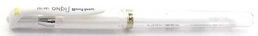
My favorite is the Uni-ball brand "Signo" pen. I've found it to be a very smooth ink and, after several years, still works well with no clogs. I bought mine at a craft store but have seen it online as well. www.jetpens.com has had it in the past but you'll have to log on to see the current availability. I've done search engine searches on these pens before and have come up with two or three other online retailers for the brand and pen.
I wanted more colors and found this 180 color set that comes with refills for all pens:
These days I'm using a lot of white paint pens that I have by a company called Miaosun. The pen is the white Acrylic Painter which is a sun and waterproof ink that's supposed to be able to write on anything. You have to really shake them up before using them each time to mix up the paint inside or it will look very thin and translucent. Give them a real good shake initially too. I found this pen on Amazon. They're very cheap individually so they're sold in packs of about 5-10.
Return to the top of the list
A lot of the early lessons mention this stamp/tool but I've been using the Colorbox Stylus Tool for sponging colors on to my scenes more these days because I think it's an easier concept for people to grasp than the Tonal Ap. The TA isn't hard to use but can require a couple key tips that aren't easy to understand in written form for some. I always used to say that I can teach someone in five minutes, that doesn't understand, but it might take me two pages of written instruction to explain the same thing.
The building block of most of the Stampscapes® stamps is the "dot". In pen and ink illustration we call this method of drawing "stippling". The Tonal Applicator is an extension of this idea. If the stamps are built out of dots, then this stamp is using the same building block --the dots-- to merge them together by using it's design to apply tone. While this stamp is a rubber stamp it's important to see it as more of a tool than an image in itself.
The Tonal Applicator is the item in the Stampscapes line that tends to cause the most confusion as to it's method of use. It's an easy tool to master in a very short period of time but there are some specific things to avoid as well as specific things to make it's usage go smoothly.
Click here for a detailed TONAL APPLICATOR LESSON
Make up sponge color application
Colorbox Stylus Tool color application
Oval Toothbrush Foundation Brush
Benefits of re-inkers
Return to the top of the list