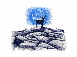
First I positioned the Ledge stamp in the center of the card. Dark hues were used. Placed above the ledge was the Full Moon Lg. The moon was meant to be the illuminating source in the composition so it was colored light blue. To give the Buck Lg design a nice silhouette against the bright moon, it too was colored in dark hues. Having a dark shape next to the light moon added contrast and widened the value range in the piece.
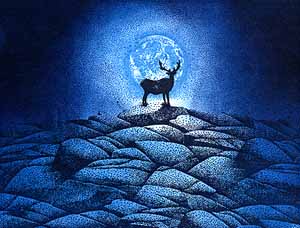
Second, the ledge was extended to continue the the idea out to the edge of the page. Overlapping to get rid of the individual image idea and to reinforce the notion of blending and oneness, the ledge merges into a single cliff. Using the Tonal Applicator a complete value scale of blue created the effect of a glowing source of illumination within the scene. Starting with the lightest blue--same as the moon--tone was applied throughout the card. I left the moon and a little of the cliff the white of the glossy paper to make the moon stand out and to highlight the buck. With each progressively darker blue used, the applications were not taken in as close as the previous hues. In other words, the moon is going to be the lightest area of the scene and moving away from it, the areas become darker--tonal transition (glow).
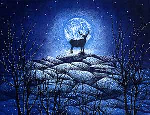
The Leafless Limbs Lg were added to give the scene depth and a white paint pen added highlights & stars to an otherwise empty sky. ©KJN 1994