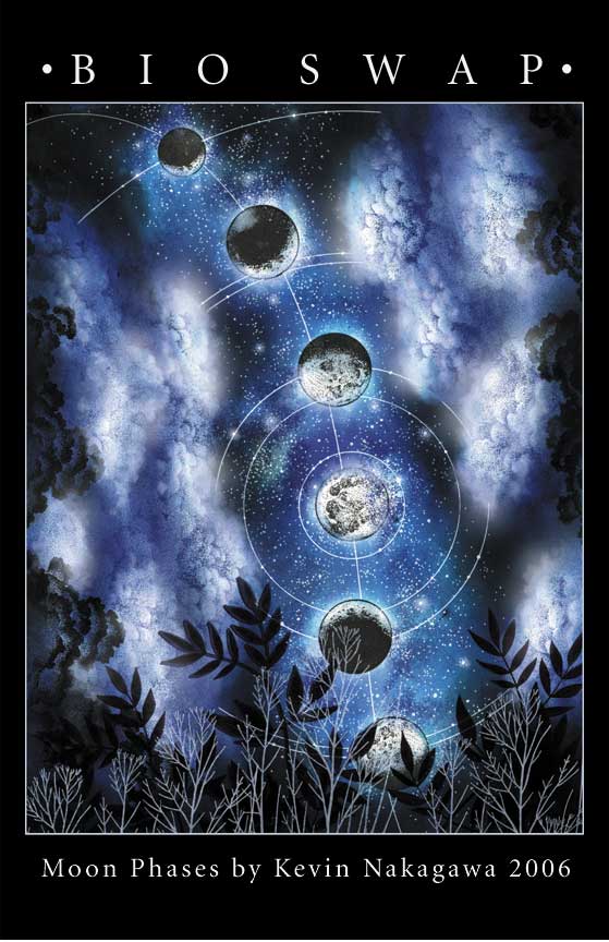
8.5" x 11" glossy card stock
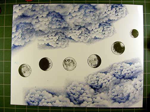
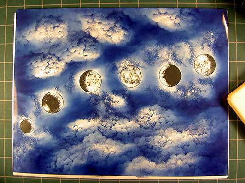
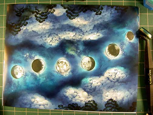
Cloud Cumulus and Cloud Cumulus Lg.were stamped in a dark blue dye based ink and two sizes of Moon Phases were stamped in a "s" curve line in black dye based ink. The Crescent, Gibbous, and Full moons were used.
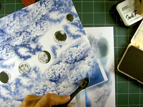
Milky Way was stamped in dark blue several times. Each time I reinked the stamp to achieve a fully saturated impression. I didn't bother masking anything including the moons as I wasn't concerned with a little overstamping. However, I was careful not to completely stamp out one of my moons or go too far into the clouds. Sometimes I angled the Milky Way slightly to get just an edge of the image to get into a hard to reach area.
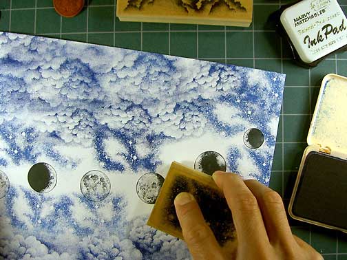
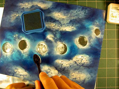
A Stylus Tool was used to apply the same dark blue dye based ink to the scene to create my lighting scheme. NOTE: I usually work from the lightest tones possible to begin my toning process but on this one I was working in a way that I've shown my intermediate classes. The difference would be that in my classes I have everyone stamp their images in black and then tone the scene with black. The trick here is to dab your stylus Tool lightly and to utilize not only a fully inked up tip but to allow it to become very dry with continuous tapping. The reason being is that you want to use the drier versions to achieve lighter toned areas of your scene. Wetter = darker. Drier = lighter.
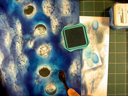
The scene completely toned. I tried to direct the lighting in the scene by creating shadows on the sides of the clouds away from the moons. The moons are the source of light in the scene so the goal in shading was to keep the sides of the clouds facing the moons light. Part of that process is to also add tone around the edge of those clouds in the sky on the milky way to create contrast against the cloud edge.
Wanting to create a brighter color scheme, a #10 Light Blue was added to the sky. I was careful to retain the illumination of the clouds by not toning them out.
To extend the temperature range of the scene a #34 Pale Green was added to the sky. By adding green over blue, we can create a warmer blue hue which can create a "color glow". I've added it into the Milky Way space of the scene. Again, be careful to retain the light areas of the moons.
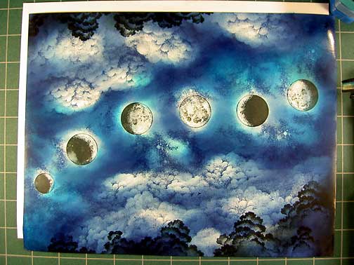
Dark Cloud was stamped in black on the perimeter of the scene. I wanted to create deeper space by placing a dark object next to the light clouds.
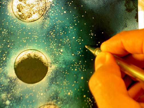
White dots were applied to the scene with a White Gel Pen. Here, I'm adding stars back into the Milky Way region that I had toned over with ink.
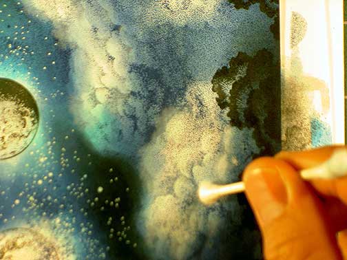
Using a cotton swab, white pigment ink has been lightly dabbed on to the clouds giving them a them a "glow" and softer appearance.
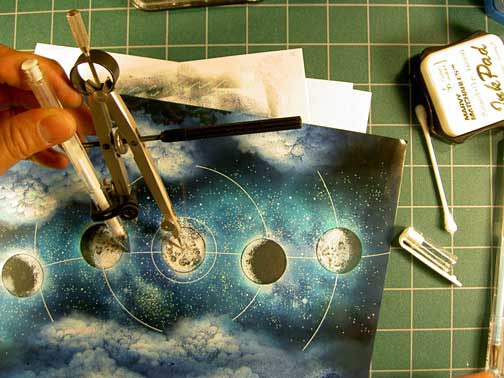
Using the White Gel Pen, a French Curve, and a compass, graphic lines were added to the scene. I wanted to create a scene reminiscent of a star chart.