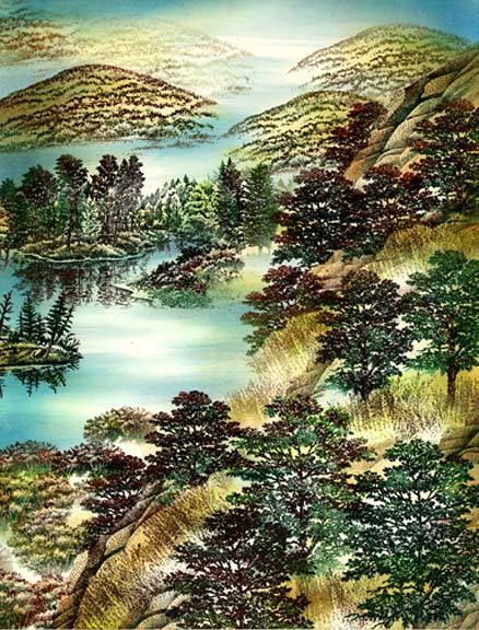
by Kevin Nakagawa, CA 2007
8.5" x 11" Glossy card stock, dye based and pigment inks, and a white gel pen.
This scene was stamped for Sandy Hulsart of the Stampscapes Yahoo groups. She coordinated the Yahoo Group Idea Card Sets which was no small task. The Yahoo Idea Card set collections came out terrific and couldn't have been easier for me to format thanks to Sandy. This scene is my impression of a trip I took to Maine a few years ago. It was at the peak of the Fall color and spent several days in Acadia National Park hiking the trails and taking pictures. I could have spent another week in this small national park with no problem. A very memorable trip.

Shagbark Hickory Sm. 241E, Shagbark Hickory 242G, Ledge 054F, and Grass Texture 208D was stamped. Composition: The method of layering imagery here is easy but it's just the amount of layering here that could seem confusing. All you have to do is to work from front to back for the most part. I've oscillated between tree, grass, and rock to make this steep ledge. Coloring: All imagery was colored with a combination of dye based pens and pads. I used a combination of greens, browns, and reds throughout the imagery. In the trees, the trunks were often blotted around the trunks as i wanted the base of the trunks to disappear into the grass. In other cases, the rocks or grass were masked and the trees stamped as if they were behind these objects.

Autumn Brook 212G, Maple Trio 240B, Maple Pair 239D were stamped. Again, multiple tones of ink were used on each image and the trees were stamped from front to back in layers.

Soft Hill 278F was stamped five times in the distance in various values created by the amount of ink on the stamp when making the impression. Lake Island 280F was stamped in the lake.
The lighting and coloring scheme has been established here using some light to medium value colors. The inks have been applied using a Colorbox Stylus Tool. I used light and medium blue colors in the water in a streaking motion leaving some of the water white (the color of the paper). Ranger "Sea Shell" (also known as "Adirondack Lights") are great inks to start out with. They're very light in value but they're also slippery and gel like. They set a great foundation for more Ranger or any other brand of inks that you build/layer on top of them. Other inks may not be as slippery as the Ranger but built on top of the Ranger line, they'll slide/blend very easy provided you use enough of the Ranger inks as the foundation. Most of the time when people have a hard time blending their inks and get blotchy applications of ink, it's because they haven't used enough of their first couple colors of ink. You not only want to color the scene but you want to almost soak the page with those early colors to lubricate the page/card.
One of the things that I like to do is to when establishing a lighting scheme in a scene is to do what can be referred to as "checker-boarding". If you look at this scene from a light and dark perspective, you can see a light-dark-light-dark-light-dark-etc. pattern from the top of the page to the bottom. There is this oscillation between the two. This can establish a rich value scheme by varying the surface of a scene. I've used areas such as dark trees, shimmering water surfaces, hills that are dark on one side and light on the other, and mist on a hillside as opportunities for this dark-light configuration. Areas such as the near sloped hillside really benefit from the presence of periodic light within it. The silhouette of the trees stay intact instead of getting obscured by decreasing the contrast between them and the background by having a little backlighting to them. My excuse for the lighting will be pockets of mist hovering on the ground. In the slope, trees, and hills Sea Shell green and tan hues were used.

Pine Tree 194F and Spruce Tree 078F were added to the scene. I felt the scene needed bold and dark shapes to play against the airy deciduous trees. Values became darker with additional medium and dark tones applied with the Stylus Tool. Where the dark trees entered the lighter grass, I needed to soften the transition. I thought I might have gone too far but the dark tones that you see here lightened when the ink had a chance to dry. Sometimes that's just the way it goes when doing scenes. You try and maximize a visual point and, in doing so, you ride the edge of going too far. But, like one of my painting teachers used to say, "It's not precious...". Meaning, try and be bold and don't worry about consequences by trying to stay in the safe zone. The unforeseen often can become the best parts of a piece, you'll push your art to the limit of potential, and if you get something that you might not like at the time, you'll have to figure out a way to minimize or detract from what you didn't and you'll learn from that and what you come up with can often improve it beyond the point that it would have been had you not had to think of a solution. And the bottom line is that if you don't like the end results of a scene --you can just stamp it again. Another professor of mine used to see the act of creating something like a performance. He didn't see any difference between practicing a scene and practicing a dance. His point was that you don't go out on opening night without having practiced so he didn't see any reason why you shouldn't go through several drafts for an eventual final performance. Do I do this? Not really, but I see his point.
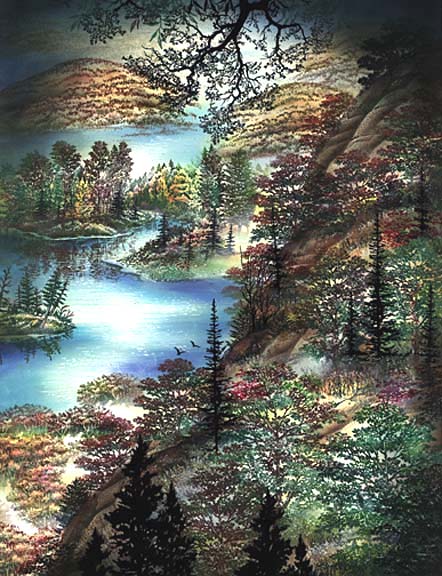
Gulls 302A and Oak Branch 203G were added to the scene. I needed something for the eye to focus on in the distant water area but I wanted it very it subtle so only two birds were used off the design. The Oak Branch was introduced as a heavy dark element to minimize the other dark but less dark areas in the scene like on the hillside shadows. A dark frame of black ink was also used across the top corners to redirect the viewers eye back down into the scene and to blend in the Oak Branch. The leaves from Rocks and Leaves 206E was used in the hillside. I needed a bright red hue within the slope to push the color scheme and to make things more interesting.
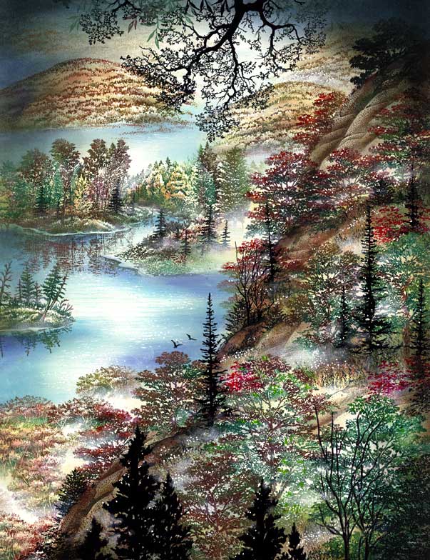
A white gel pen was used to add sparkling highlights throughout the scene such as in the water, on plants, bushes, and trees. White pigment ink was used to soften and lighten areas throughout the scene. This ink was basically added to the edges of the areas that were already established as light by not adding ink over them. Trick to adding the pigment ink to the scene is to not add too much at one time. Add the ink in a dry brush method where a couple taps with an applicator (I use a cotton swab) results in practically nothing but only through a series of taps will the pigment ink start to appear. The ink goes on very slowly and carefully this way. I still get too much in many areas but the beauty of the pigment ink on glossy paper is that it won't dry fast so you'll have ample time to remove as much ink as you see fit.