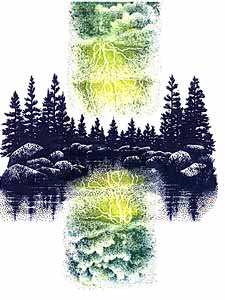
First stamped was Lakeside Cove Lg in dark colors to contrast against the Cloud w/Lightning. The C w/L was colored in yellow, yellow green, and green. Yellow was colored closest to the flash and the two others were mixed throughout.
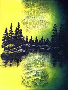
Second came the use of the Tonal Applicator for blending purposes. Using the same colors as on the C w/L stamp, hue was glazed onto the surrounding area making the lightning the brightest points in the scene--in sky and H20--therefore, I was careful not to tone over the bolts. To create the yellow-to-green transition (light to dark) the first hue used was yellow. This was "taken in" right up to the C w/L. The next color--yellow green--wasn't stamped in quite as close as the yellow was-- as with each subsequently darker hue. Note: in the 2nd card 1 side was left yellow to illustrate the transitions between color layers.
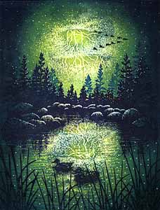
Third scene: The Water Pattern stamp was used to add texture to the lake's surface. Starting with yellow green,
the pattern was dabbed repeatedly starting from the outside-in (as with the T.A.). This way, each subsequent impression
became lighter as it approached the light source--lightning. Ducks in H20 Lg & Ducks in Formation added visual interest.
Darkly colored Reeds Lg added depth and complemented the bright lightning. Lighter toned impressions of the Lakeside Cove Lg's
trees behind the first impression, also added visual depth. An Extra Fine white paint pen completed the scene adding highlights to the rocks and sky and made the water's surface "sparkle".
©KJN 1994