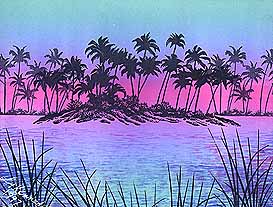
"Tropical Jewel" 1997. Laura Kennedy, CO. Images by Stampscapes®.
Medium: Dye based colors (Birthstone Kaleidacolor ink pad), glossy card stock.
Notes: A "jewel" of a scene. Laura used a Kaleidacolor ink pad for the background of this piece. The actual images are stamped in black for the most part. The texture range of this scene is enhanced by the delicate use of the Water Pattern for the Palm Island's surrounding waters. Sticking with her ink pad's color scheme, Laura stamped this texture in in variations of blue, pink, and purple. The sparce usage of this texture in the middle of the scene almost makes her water seem to "shimmer". To offset the horizontal "movement" of the water texture and to give depth to the scene, Reeds Lg. was stamped in the foreground.
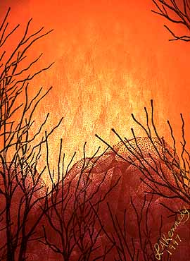
"Forest Fire" 1997. Laura Kennedy, CO. Images by Stampscapes.
Medium: Dye based colors (Printworks Designer Inks, Marvy Brush Markers).
Notes: Deep warmth in this piece. A perfect example of what I like about transparent colors when it comes to layering them. There's such a richness and depth to the scene. Laura's layered various tones from a transition of yellows, oranges, reds, and brown to create this fiery look. Tones were laid out with the Tonal Applicator then, on top of them, the Tonal Applicator- Flame was used to add the "flamed" textures that rise from behind the Boulders. The dark, Leafless Limbs is a perfect foreground for the scene. It added contrast, depth, and texture. It also made the background warmth seem that much brighter and lighter by comparison thus extending the value range (light to dark).